
A high-converting homepage is a homepage that guides visitors toward a meaningful action, such as booking a call, signing up, or exploring services.
It does not try to explain everything.
It does not overwhelm visitors with options.
It focuses on clarity, trust and direction.
Instead of asking visitors to think, it helps them feel confident enough to act.
In practical terms, homepage optimization reduces friction, answers unspoken questions and makes the next step obvious. It is what makes a visitor move from being a passive observer to becoming and active user of the page.
Why a high-converting homepage is important
For many businesses, the homepage is the most visited page on the website. It is often the entry point for traffic from search engines, ads and social media.
Here’s the brutal truth: If the homepage fails, everything else suffers.
A strong homepage:
- Improves conversion rates
- Reduces bounce rates
- Makes marketing campaigns more effective
- Builds credibility and trust quickly
- Sets expectations for the rest of the website
Your homepage acts as a filter. It attracts the right people and repels the “not for me” ones. When designed intentionally, this saves time, money, and effort across your entire marketing funnel. Think about it: what’s the cost of 1,000 homepage visitors who bounce versus 1,000 who stay, explore, and convert at 5%? That’s 50 leads you didn’t have. That gap compounds every single month.
At Design Evolution, we’ve seen this with Halton Region businesses: homepage optimization can double conversion rates within weeks. Whether you’re building from scratch or planning a website redesign, getting the homepage right is your highest-leverage improvement.
The Anatomy of a Homepage That Actually Converts
A high-converting homepage follows a clear structure designed around user psychology, not personal taste.
Let me show you what that looks like.
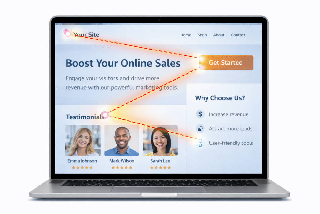
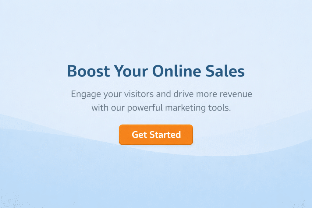
Clear value proposition above the fold
Visitors should immediately understand: who the website is for, what problem it solves, and why it matters.
Strong examples include benefit-driven headlines that focus on outcomes rather than features. Not “We provide innovative solutions for modern businesses.” Try “We help SaaS companies cut customer onboarding time in half.” See the difference? One could apply to anyone. The other is specific, benefit-driven, and instantly tells the visitor if they’re in the right place.
Notion nails this. Their homepage doesn’t say “Productivity software” or “Collaboration platform.” It says “Write, plan, share. With AI at your side.” Then immediately below: “Notion is the connected workspace where better, faster work happens.”
Strong visual hierarchy
Visual hierarchy guides the eye and reduces cognitive load. Important elements stand out, while supporting content stays subtle.
This helps visitors scan the page effortlessly and understand what matters most. Most homepages fail here because every section screams for attention. Headlines are huge. Subheadings are huge. Buttons are huge. When everything is important, nothing is.
Trust and credibility signals
Here’s what works: testimonials with real photos and specific results, client logos (but only if they’re recognizable), certifications that matter to your audience, case studies with actual numbers, credible awards.
Here’s what doesn’t: a wall of logos no one recognizes, testimonials that say “Great company!”, fake 5-star ratings, anything that feels manufactured.
Shopify does this brilliantly. Their homepage features real store owners with real businesses, explaining specific problems Shopify solved for them. Not generic praise but actual stories.
Clear calls to action
High-converting homepages tell visitors exactly what to do next.
Calls to action (CTA) should be visible, specific, and aligned with visitor intent. Rather than generic wording, effective CTAs explain the value of taking the action.
“Get started” is lazy. “See pricing” is better. “Get your free site audit” is even better because it tells me exactly what I get.
Mobile-first and responsive design
A homepage that converts on desktop but fails on mobile is not truly high-converting.
Responsive design ensures your homepage adapts seamlessly across all devices. Mobile users need clear messaging, readable text, and simple navigation without friction. They’re probably standing in line at the grocery store or sitting on a train. They won’t pinch-zoom your tiny text or navigate your five-level dropdown menu.
Test this: open your homepage on your phone right now. Can you read the headline without zooming? Can you tap the CTA button without accidentally hitting something else? Does your page speed meet expectations—loading in under three seconds?
If you answered no to any of these, you’re losing conversions.
Emotional connection
Beyond structure, great homepages make people feel something.
Through imagery, tone of voice, and flow, they create confidence, relief, curiosity, or excitement. This emotional layer is what turns interest into action.
The Homepage Mistakes Killing Your Conversion Rate
Even well-designed websites fail due to common homepage mistakes. I see these constantly:
Vague or clever headlines that do not explain value. “Reimagining the future of work” tells me nothing. Are you a desk manufacturer? A productivity app? A consulting firm? I shouldn’t have to guess.
Cluttered layouts that overwhelm visitors. Your homepage is not a buffet. Stop trying to show everything. Focus.
Too many calls to action competing for attention. “Book a demo” “Download our guide” “Start free trial” “Watch video” “Read case study” – pick one.
Long blocks of text above the fold. Nobody reads your three-paragraph introduction. Nobody.
Autoplay videos or intrusive pop-ups on first load. Want to annoy someone within one second? This is how.
Stock imagery that feels fake or generic. You know the ones. Diverse team laughing at tablet. Woman in headset smiling unnaturally. Man pointing at graph.
Poor website performance and slow page speed. Even beautifully designed homepages fail if they take five seconds to load. Page speed optimization isn’t optional—it’s a conversion requirement.
These elements increase friction and reduce trust, even if the website looks modern. Beauty without strategy is decoration, not design.
How to Actually Fix Your Homepage
Start by clarifying your message. Open your homepage. Read the headline out loud. If a stranger would struggle to explain what you do after hearing it, rewrite it.
Simplify the layout. Remove anything that does not directly support understanding, trust, or action. Kill your darlings. That clever animation? Gone. That extra CTA? Gone.
Guide visitors intentionally. Use visual hierarchy and page flow to lead them toward one primary action. Think of your homepage as a user journey, not a buffet. Each section should naturally lead to the next, creating momentum toward conversion.
Strengthen trust. Add social proof, reassurance, and credibility where hesitation is most likely. That’s usually right before the main CTA.
Design for emotion as well as logic. A homepage that feels calm, confident, and human converts better than one that simply looks impressive. Mailchimp mastered this—their whole brand feels friendly and approachable, which reduces anxiety around “complicated email marketing.”
Implement landing page design best practices. Whether your homepage functions as your primary landing page or you have dedicated campaign pages, the same principles apply: clarity, single focus, and reduced friction.
Address technical fundamentals. A high-converting homepage needs solid SEO foundations including optimized title tags, meta descriptions, and fast loading. When working with a professional web design agency, ensure they’re considering both conversion optimization and search engine visibility from the start.
Finally, test and refine. Use analytics, heatmaps, and A/B testing to understand where visitors disengage and why. But don’t get lost in testing minutes. If your headline is vague and your CTAs are unclear, no amount of button color testing will save you.
Final thoughts
A great homepage is not about trends or decoration. It is about performance.
When your homepage delivers clarity, builds trust, and creates emotional confidence, it becomes one of your strongest business assets.
If your homepage is not converting, it is rarely broken. It is simply unfocused.
Fix the focus, and the conversions follow.