Your website is often the first interaction people have with your brand. In just a few seconds, visitors decide whether they trust you, understand you, or want to keep exploring; and that’s exactly why emotional web design matters more than any feature list.
That decision is not logical, It’s emotional.
This is why emotional web design matters more than any feature list. Research in psychology and neuroscience consistently shows that emotion drives decision-making, while logic simply justifies it afterwards. This principle applies just as strongly online as it does in person. If your website fails to create a positive emotional response, visitors hesitate; hesitation kills conversions.
At Design Evolution, we’ve seen this with Halton Region web design businesses: companies invest in professional web design services, add features, optimize SEO but still struggle with conversions. The missing ingredient isn’t technical, it is psychological.
Emotion is not a “nice to have” in web design. It is a core driver of user experience, trust and conversion.
The science behind emotional decision-making
Neuroscientist Antonio Damasio’s research demonstrated that people who have damage to their prefrontal cortex lose their ability to process things, even when their logical reasoning remains intact. His conclusion was clear: emotion is essential to action.
“Emotion is essential to action.” – Antonio Damasio
Behavioral psychology reinforces this through Daniel Kahneman’s System 1 and System 2 model. System 1 is fast, intuitive, and associative; System 2 is slow, deliberate, and logical.
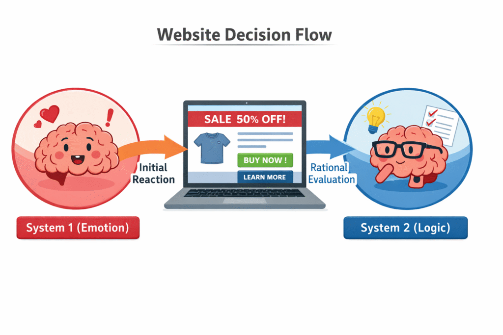
Think of System 1 as your website’s bouncer, it decides in milliseconds who gets in.
When someone lands on your website, System 1 is in control. This means visitors react emotionally to your design and ‘vibe’ before they ever consciously evaluate your services. Visual clarity, colour choices, typography, and ease of navigation trigger the instant responses that ultimately dictate behaviour. If that first emotional reaction is negative or neutral, most visitors never reach the logical stage.
How emotional web design affects website behaviour and conversions
Emotion directly influences how users behave on a website because when visitors feel trust, they are more likely to submit forms, book calls, or make purchases. When they feel confusion or anxiety, bounce rates increase and conversion rates drop. When visitors find clarity, they gain the confidence to explore more pages and engage longer.
UX studies also show that users are more forgiving of small usability issues when they feel positively toward a website. This is known as the halo effect. A site that feels professional and human is perceived as more credible overall. Airbnb mastered this because their imagery and words don’t sell rooms, they sell the feeling of belonging anywhere.
In practical terms, emotional web design improves:
- User engagement
- Time on page
- Conversion rates
- Brand perception
Emotion does not just influence experience. It influences results.
Why emotional web design matters in a competitive market
Most businesses today offer similar services at similar prices. Features alone no longer differentiate brands. Emotion does.
Mobile-friendly layouts are expected. A website that creates an emotional connection builds trust faster and reduces perceived risk. It helps visitors feel comfortable choosing you, even when competitors exist.
In crowded markets, people rarely have the time to find the objectively best option. They choose the option that feels right.
Your website plays a major role in creating that feeling. Stripe is a perfect example. Their product is payment processing, not exactly emotional stuff but their website makes you feel like you’re joining something innovative, clean, and trustworthy. That feeling became their competitive advantage.
How to measure emotional connection on your website
Emotions are intangible assets and they cannot be measured objectively. This is why its effects are measured through user behaviours and interactions.
High bounce rates often indicate immediate emotional friction. Short time-on-page suggests lack of engagement or interest. Abandoned forms can signal uncertainty or anxiety at the moment of decision.
Tools such as heatmaps and session recordings reveal where users hesitate, scroll past, or drop off. A/B testing different emotional approaches (such as warmer visuals versus formal ones or conversational words versus corporate) can show which resonates. Qualitative feedback, including short on-site surveys asking how visitors felt or what stopped them from taking action, can uncover emotional blockers that analytics alone cannot show.
Try this: Open your website in incognito mode. Give yourself 3 seconds. Close it. What did you feel?
If the answer is “nothing,” you have your answer.
If users are not behaving the way you expect, the issue is often emotional rather than technical. Not sure how your site stacks up emotionally? Our free website audit covers exactly this.
Practical ways to apply emotional web design on your website
Emotional connection is built through intentional design and content choices, not isolated features.
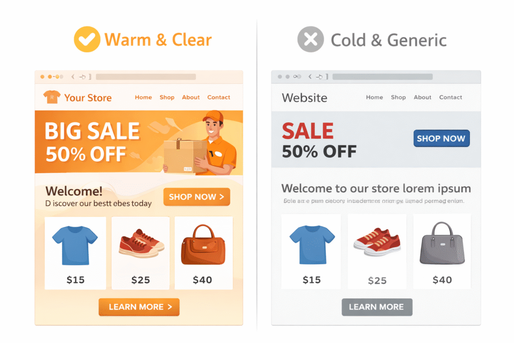
Clarity is the foundation. Visitors should instantly understand who the website is for and how it helps them. Clear messaging reduces uncertainty and builds confidence, whereas confusion creates anxiety and drives exits.
Visual calm is essential. Clean layouts, generous white space, readable typography, and consistent design patterns reduce cognitive load and create a sense of ease. While design systems are useful for consistency, they often kill emotional connection when they become too rigid. Use your design system as a foundation rather than a straitjacket to keep the experience feeling human.
Human-centred imagery builds trust. Real people, authentic environments, and relatable visuals trigger empathy far more effectively than generic stock photography. That photo of a diverse team laughing at a laptop while pointing at a screen? Nobody believes it. Show real customers, real team members, real moments.
Tone of voice should feel human and reassuring. Writing that acknowledges visitor concerns and speaks in plain language makes people feel understood. Talk like a person, not a press release.
Guided user journeys reduce emotional friction. Clear calls-to-action, logical page flow, and reassuring microcopy help visitors feel safe taking the next step. A website redesign often fails not because the CTA buttons are the wrong color, but because the visitor never felt confident enough to click them.
Trust signals reinforce emotional confidence. Testimonials, reviews, and clear contact information work when integrated naturally into the page. A testimonial that says “Great service!” is worthless. A testimonial that tells a specific story of transformation is gold.
Emotion emerges when all of these elements work together.
The hidden cost of ignoring emotion in web design
Many businesses invest heavily in SEO, paid advertising, and content marketing, only to send traffic to websites that fail to connect emotionally.
When emotions are missing, traffic does not convert efficiently. Marketing costs rise, opportunities are lost, and the problem is often difficult to diagnose because the website appears “fine” on the surface.
Whether you’re running a WordPress site, an ecommerce store, or a custom platform, the technical foundation matters. An emotionally intelligent design closes the conversion gap by aligning user experience with human psychology.
Final thoughts
Your website is not just a digital brochure. It is an emotional experience that shapes how people perceive your brand and whether they choose to act.
If your website makes visitors feel confused or uncertain, it works against you. If it makes them feel calm, confident, and understood, it becomes one of your most powerful business tools.
Emotional web design is no longer optional. It is what separates websites that exist from websites that perform.
Ready to find out if your website connects emotionally? If you suspect your site is missing the feeling that turns visitors into customers, we’ll tell you exactly where. Request a free website audit and we’ll review your homepage’s emotional design, trust signals, and conversion friction — then give you a clear roadmap for improvement. Built specifically for Halton Region small businesses.